
04 — Non-profit
La Seconde Chance
Help for everyone
The challenge
La Seconde Chance supports people through social, medical and professional crises. Its online presence did not match the work: no clear way to give, no way to understand what the money does, and a reputation that needed repairing in public.
The response
A site organised around the person being helped rather than the organisation helping. Every donation amount is tied to a concrete outcome, and the giving flow is three fields long. Transparency is structural, not a page in the footer.

01 — Approach
Lead with the person, not the org chart.
The old site opened on governance. The new one opens on a single case and what changed. Institutional information still exists — it just stopped being the first thing a stranger meets.

02 — Design system
Warm, plain, and impossible to mistake for a campaign.
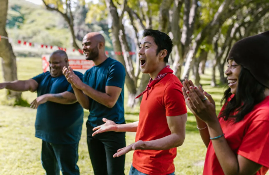
A violet accent kept for the giving path and nothing else, generous line height, and photography treated with a consistent grade so donated images from many sources still read as one voice.

03 — Development
Vue, a payment flow, and tests where it matters.
Built in Vue with content driven from JSON so the team can publish without touching code. The payment path is the only thing under unit test — a broken donation is the one failure the organisation cannot absorb.
04 — Outcome
A public face the work deserved.
Giving went from a phone call to three fields. The JSON content layer meant the team could publish new cases weekly without a developer in the loop.
Stack
- Vue.js
- JSON content
- Payment integration
- Unit tests
Services
- Frontend development
- UI / UX design
- Payment system
Images
- Photography — La Seconde Chance
Start something