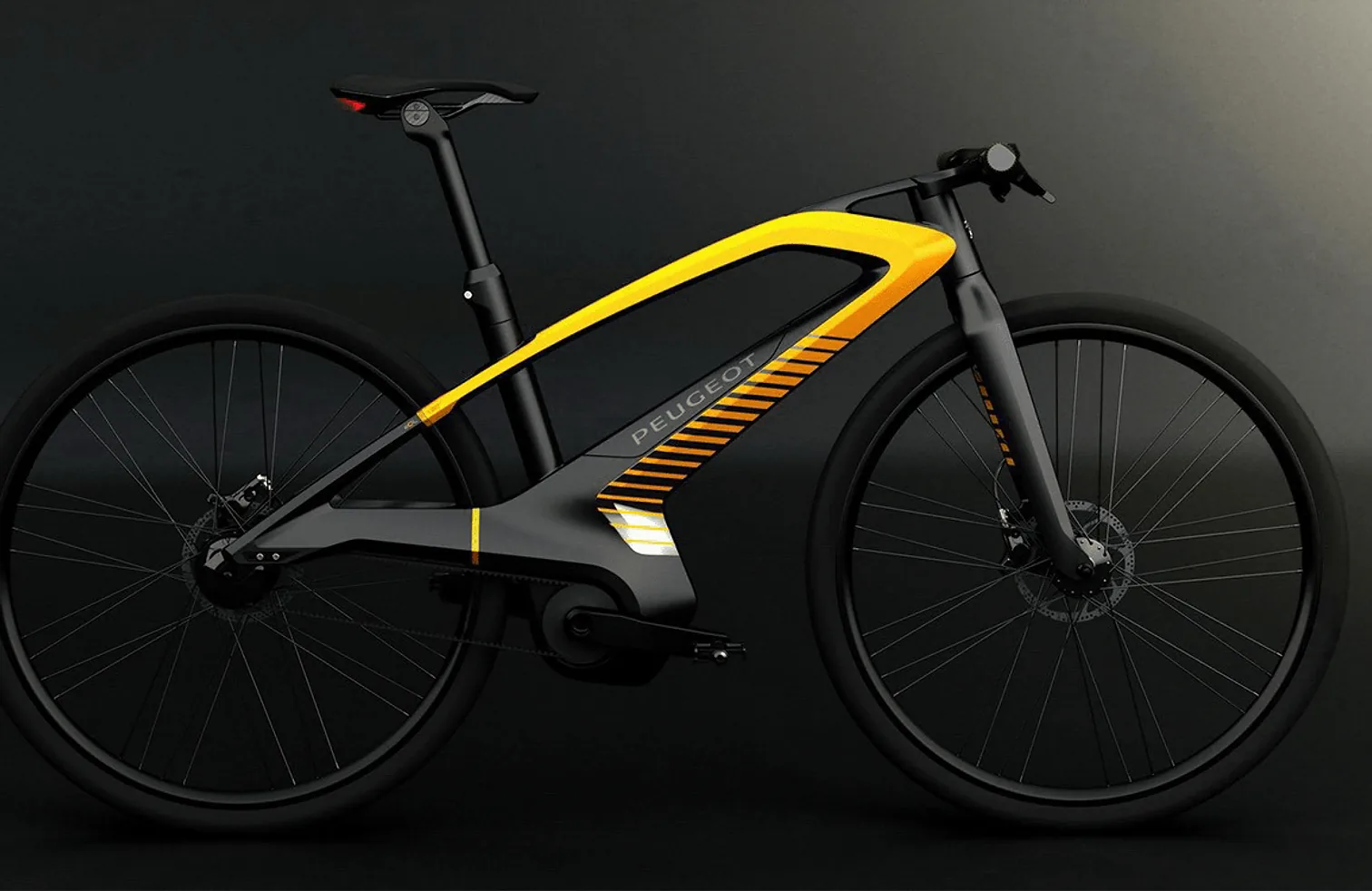
07 — Brand campaign
Peugeot
Time is running out — move differently
The challenge
Make a case for changing how people move, without the visual clichés of ecology communication — no leaves, no earth tones, no guilt. The argument had to feel like acceleration rather than restriction.
The response
The site is built on momentum. Carbon data arrives as speed lines and slipstream, the palette is dark chrome with one brake-light red, and every scroll gesture pushes you further into the argument instead of down a list of facts.
01 — Approach
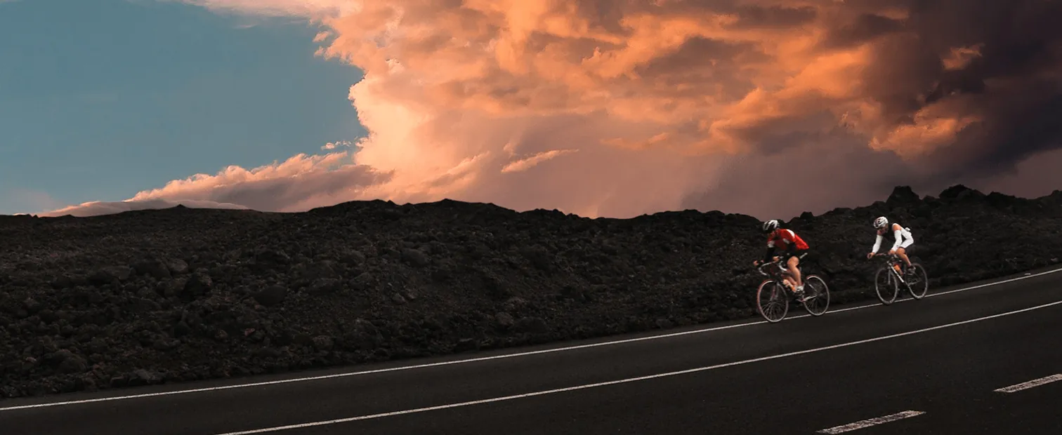
Sustainability as acceleration, not sacrifice.
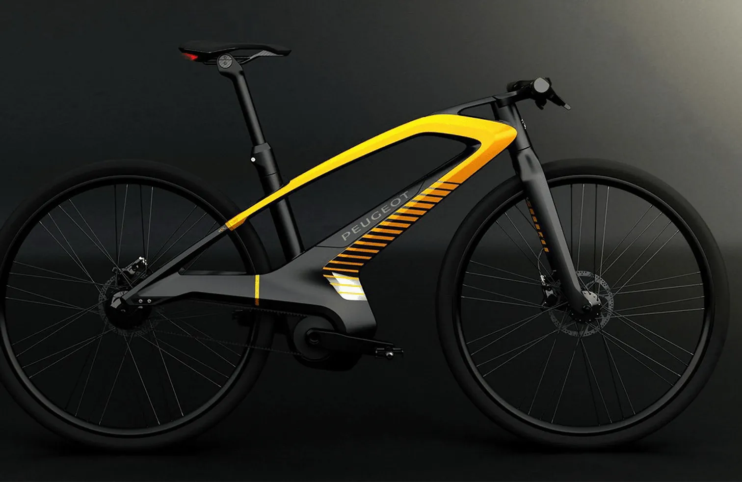
We inverted the usual register. The visual argument is aerodynamic — the low-carbon option is the faster, sharper, better-engineered one. Data still carries the case, but it is delivered with the energy of a performance campaign.
02 — Design system
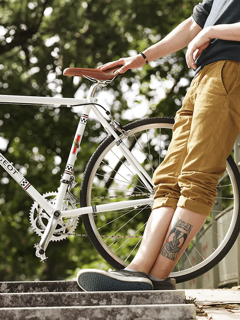
Dark chrome and one brake light.
A full design system built for the campaign: near-black surfaces, chrome-grade neutrals with real specular behaviour, and a single signal red reserved for the moments the argument lands.
03 — Development
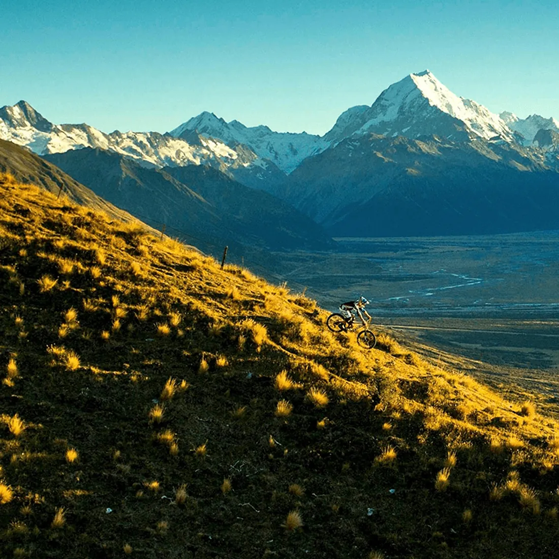
Motion as the primary medium.
Every section is a choreographed sequence rather than a static block — speed lines respond to scroll velocity, transitions carry momentum between sections, and the whole thing was optimised so the motion never stutters on a mid-range laptop.
04 — Outcome
An ecological argument that moves fast.
Reframing the register was the whole project — the finished site reads as a performance campaign that happens to be about carbon, which is exactly what the brief needed.
Stack
- JavaScript
- Design system
- Motion system
Services
- Development
- Motion design
- UI / UX design
- Optimisation
Start something